Paperless office…not really.

March 9, 2012 § Leave a comment

The Filing Pony Wall

Storage as Breakout space

Shelf Design

Storage as Space Shaping

Architectural Shelves Storage, Commercial Office Design, the office landscape

Storage as an Architectural Feature

Binder Storage, storage Stairs, Commercial Office Design, the office landscape

Storage as Structure

Desking, Lateral Filing, Commercial Office Design, the office landscape

Storage as Area Marker

Meeting Room Design

Storage as Branding

Office Design

Storage as Furniture

Office Design

Poll: What’s important for your office

February 28, 2012 § Leave a comment

Haworth Collection: Quickship

February 28, 2012 § Leave a comment

You know what I LOVE about Italian lighting, furniture, design, etc….EVERYTHING

You know what I HATE about Italian lighting, furniture, design, etc….WAITING

I hate long lead times.  And for those of you that want to blather on about putting something up in-lieu, or future-proofing for when that gets there, zip it.  It never happens, or isn’t coordinated well, or it costs an arm and a leg to get the installer back, or ‘what we have right now is working’, and on and on.

I am always indebted to companies that have quick ship programs.  They understand that there are design sectors that have tight deadlines, and are working with us to pull off great design.

Introducing: The Haworth Collection Quickship Program.  13 pieces in limited finishes, that have a 14 day lead-time from Holland, MI (USA).  There are also 70 other pieces available from Poltrona Frau, Cappelini, and Cassina on a 10 week lead-time available through your Haworth dealer or haworthcollection.com.  Now here are the beauties in all their shining glory.

Creativity: John Cleese

February 26, 2012 § Leave a comment

For all the other Designers out there, Interiors or otherwise, a small excerpt from a John Cleese seminar on creativity, observation, and not knowing what you’re doing.

Collaborative Furniture: The Unilever Office

February 26, 2012 § Leave a comment

Reblogged from Contemporist.com

Open Office Spaces: The Good, The Bad, and The Ugly.

February 26, 2012 § Leave a comment

Reblogged from MyVenturePad: Small Biz Bee

(http://myventurepad.com/smallbizbee/83904/open-office-spaces-good-bad-and-ugly)

Depending upon the location of your lookout perch on the nation’s workforce tree, you may or may not be aware of a rapidly growing trend in workspace design—the trend toward open office spaces. Popularized by an explosion in the European market, open offices are now catching on in the States, even though the precise definition of “open” is itself still very much open to interpretation. In some settings, the traditional “four walls and a door” office is being replaced by various forms of less compartmentalized partitioning where employees are still somewhat separate while working more closely together.

In the more extreme cases, every kind of wall is undergoing the same fate as the Berlin Wall—tumbling down completely—and the result is an environment where employees sit together with no barriers between them in a large central workspace. The common denominator here is the evolution from an isolated and insulated atmosphere to a more unlocked, uncovered, and unplugged one. But is this trend a good thing? This is the subject of a very spirited and ongoing debate.

Interestingly, both the proponents and detractors of open space offices tend to relate their arguments to a very similar, and nearly identical, set of metrics. Supporters often cite the positive effect of open space on employee morale, workforce productivity, environmental concerns, and individual worker performance. But detractors will point out how openness impacts these same criteria—only in a negative way. Let’s take a closer look at the pros and cons and maybe we can learn something:

Employee Morale

  • Why open space is good: Even animals in the zoo don’t like being cooped up in cages, right? This is why you see many of them roaming around modern zoos in open-looking areas that somewhat resemble their natural habitats. Well, common sense tells us that if it works for animals it should work just as well for people. Open offices afford the ideal conditions for humans to roam around and in the process make friends, collaborate with co-workers, communicate more, and achieve a true sense of community within the office space. All these things are bound to add up to higher employee morale.
  • Why open space is bad: Morale is great when you are sitting face to face on a daily basis with someone you like. But what if that person happens to be someone you dislike? And communication can be great—but some kinds are much better than others. Unfortunately open spacing gives us the bad along with the good. Being forced to listen to every co-worker’s phone calls and conversations, not to mention bad-mouthing and gossip, can kill morale instead of enhancing it. And another side effect of openness can be a higher risk of personal property theft. What could be more demoralizing than that?

Productivity/Bottom-line Profits

  • Why open space is good: Studies have shown that open space offices are very cost-effective, saving businesses upwards of 20% in overhead costs. More people can be fit into workspaces and if the right kind of furniture is chosen, planners can maximize their usable space. Also, open spaces tend to more naturally accommodate modern work practices such as teleworking and office-sharing.
  • Why open space is bad: A study by Australian scientists published in the Asia-Pacific Journal of Health Management concludes that open space offices are bad for employee health. The research found that in 90% of cases studied, “the outcome of working in an open-plan office was seen as negative, with open-plan offices causing high levels of stress, conflict, high blood pressure, and a high staff turnover.” Germs are also more easily transmitted, leading to more employee sickness and a loss of production. Another negative risk to the company’s bottom line is the potential for theft of company secrets. In an open office space, the odds of someone seeing or hearing confidential or business-sensitive information increases considerably. And a leakage of proprietary information can not only destroy profits but can destroy entire companies too.

Workplace Environment

  • Why open space is good: For many of the same reasons that consolidation into an open space plan yields corporate cost savings, it can also result in a greener workplace. Facilities with open offices are generally more eco-friendly due to greater efficiencies in heating and cooling.
  • Why open space is bad: One type of pollution that usually rises in an open setting instead of falling is noise. There is more of it around and more employees are exposed to it. A 2002 study cited (in addition to lack of privacy and confidentiality) increased noise as a primary complaint of open offices listed by surveyed employees.

Individual Worker Performance

  • Why open space is good: It’s not hard to see how an open office design can facilitate more teamwork and better communication. In support of this premise, a 1996 research study published in the Harvard Business Review revealed that companies that had modified their business processes by, among other things, migrating from private spaces to open environments realized performance increases averaging 440 percent.
  • Why open space is bad: Lack of privacy is often cited as a downside of open space offices, but its impact can be more profound than simply a feeling of inconvenience. In her book Communication Theories in Action, Julia Wood explores the dynamics of communication from a performance standpoint, and offers the theory that there are two types of communication, both of which are needed to be effective: “front stage” (in front of an audience) and “back stage” (where one can relax and not have to worry about what others think). The danger of open offices is that employees may no longer have an individual office area to recuperate from the demands of continual front stage interactions.

So what do we conclude from all this? Well, the fact that there are undeniably positive aspects to open offices is surely a good start. The common-sense thinking is that if we can figure out how to design the open spaces in a way that keeps the good and eliminates (or at least cuts down) the bad lends hope to the thought that the trend is overall a good one and that the negatives can be looked upon as road bumps that need to be overcome. Variations of open office design are already being tried with positive results, some of them based on a very early study by Greg R. Oldham, whose research as far back as 1988 provided information on solutions to some of the problems presented by open office design. The trend towards open offices is not likely to go away anytime soon but there is definitely hope that it can be tweaked and managed in a way that will make open offices look increasingly good, less bad, and never ugly.

Tiny Bubbles: small office spaces

February 25, 2012 § Leave a comment

This is a discussion that needs to be had.  There are so many award-winning designs, with images of HUGE office spaces, with GIANT bowling alley walkways, and ENORMOUS reception areas.  As with other high-cost-of-realestate, low-vacancy-rate cities, our Vancouver designs have to fit into a smaller footprint.  Sitting around 5% vacancy, Downtown Vancouver is a tight market that has companies shopping for real estate longer, putting more pressure on design and construction when a lease deal finally is made.  It’s like shopping forever for your wedding dress, and then not taking the time for a fitting.

Great Solutions are:  Telecommuting, Hotelling, Flexible Work Areas, Flexible Work Times and more

BUT, in the spirit of size doesn’t matter, here are some micro-offices and furniture pieces…

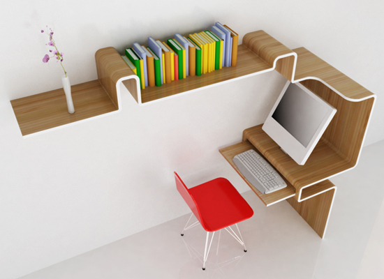
K Workstation - Miso Soup Design

Knoll 'Antenna' System with 'Fence' Component

As a note: I genuinely like the Antenna system from Knoll.  It took a second to wrap my head around the possibilities of this system, but it is a clean, pure system that allows for desking, benching, designation of space through components, and amazing flexibility of space and combination of pieces for a great system.  I would suggest having a Knoll rep walk you through the system rather than a dealership rep, as the Knoll people can really impart what this baby can do.

Color as Space designator - 2x2 office design

Small Desk - Officemagz.com

Shared Private Offices - decoriz.com

Shared Private Offices - decoriz.com

Small Private Office Furniture - Ardavira.com

A Scary Solution - Kladezi.ru

Drop-In spaces - Interiordesign.com

Using Meeting Furniture, Rather than Meeting Space

Systems Furniture Dictionary

February 25, 2012 § 1 Comment

BF, BBF, FF, Pelican, Pencil??

As with any industry, systems furniture has its own vernacular, its own language.  When I first started, I had no idea what a Box Box File was.  And trying to explain this alien language to a client on a furniture showroom tour is insane. So, here’s a brief synopsis of the Systems Furniture Dictionary, not in alphabetical order, and to be added to sporadically (super useful, right?):

Haworth X-series Mobile Ped - Pencil Box File w Cushion Top

BBF – Box Box File.  This describes the types of drawers in a storage system, with the top 2 drawers being a 5″-6″ ‘box’, and the lower drawer being sized to hold a ‘file folder’ height.

BF – Box File. See above. Only (1) ‘box’ type drawer.

Pencil – drawer sized for ‘pencils’.  Typically only 1-3″ deep, and is in combination with box and file drawers.

Pedestal – AKA: a Ped.  A freestanding storage piece that contains the BBF, BF, etc drawers.  Can also be on casters, which is then a ‘mobile ped’.  Also can have a cushion top, to double as seating.  See above image.

Pelican Drawer – A drawer that is typically mounted to the underside of the work surface.  It has a deep section at the back of the drawer for larger items (purses, files, etc), with the front of the drawer being only 4-5″ deep to not impinge on knee space.

Haworth 'Compose' Panels

Panel – these are are vertical panels which provide structure to your systems, separate workstations, and contain runs of power to each workstation.  These can vary in height, width, and material.  Typically, they are 42″-60″ tall (and hopefully getting shorter everyday).  Glass can be specified for the top portions of the panels, to allow light through, without compromising acoustics.  Panels are ‘skinned’ with ‘fascia’ or ’tiles’ that can be changed out at any time,  completely changing the look of the panel.  This skin can be glass, fabric, whiteboard, accessories rails, plastic, metal, laminate, or a combination of any.  The Haworth ‘Compose’ panels below show a framed glass upper panel, with laminate exterior, fabric interior.  As seen, these materials are stacked on top of each other, to form the panel – this is a typical construction.  Please also ooh and aah over the sliding door – a component that can usually sell managers looking to stay in their offices to make the move to workstations.

Open Base vs Closed Base – Base = the lowest 4″ of panel.  The Compose panels above are a monolithic panel that does not have a ‘base’ per se. Panels are trending towards an open base, as it visually opens up the workstation, allows better air flow, and has a cleaner look.  This means that power run along the base moves up into the panel itself.

Blade Panel – A thin glazing panel that clips onto the top of an existing panel.  It doesn’t require the frame structure of the panel, so tends to be less expensive, and is a great option to add if you feel that acoustics is an issue.  Do look at the attachment structure, as some cheaper versions can become wobbly over time.

Off-Module – Panels are designed to have components hang off of them at specific intervals.  Any piece that does not fit that interval is said to be ‘off-module’ and usually requires hardware that is slightly more expensive.  Sometimes going off-module is a better choice, mostly, I try to stay on for the cost savings, and I like the aesthetics of everything lining up perfectly.

Workstation – the combination of furniture that makes up (1) person’s work area

Haworth Reside Desking

Worksurface – A desktop.  And while some see this as straightforward, the shape of the desk can affect how you work, the addition of a return can affect how you file, and the leg and edge style can affect the look of the entire design.

Adjustable Height Worksurface – A crank or hydraulic lift system that allows the worksurface to be set to a low or standing height (or anywhere in between). A great solution for those with bad backs, those who need a higher table for standing meetings, but also a desk to sit at, or clients that want flexibility in their surfaces (ie: classroom seating, counters and desks, auditorium high seating, etc).

Overhead Bin – Overhead storage for files, paper, etc.  As the office landscape is trending towards a lower landscape, and ‘right to light’, these bins are going the way of the dodo.  Some firms believe they add to acoustic privacy, others create this privacy with other elements – see storage tower below.

Haworth X-Series Storage Tower

Storage Tower – Vertical storage furniture, that can hold drawers (BBF, BF, etc), hanging coat storage, paper pigeon holes, etc.  See above.

Haworth 'Patterns' Casegoods

Casegoods – Freestanding furniture systems used in private offices. Typically of a higher finish quality than workstations.

Haworth 'Patterns' File Island

File Island – Filing storage, banked into a group.  Typically at 3High files, so that you can meet and lay out files on top of the island.  4High is used where you are trying to architecturally divide space.

Lateral vs Vertical Files – Lateral files are longer horizontally, vertical files are deeper. Vertical files also tend to hold more storage, but can be harder to work around, as offices are becoming narrower.

Haworth 'Reside' Storage Spine

Storage Spine – In a panel system, a panel separates the workstations.  In a storage spine, storage pieces are used as structure, to create privacy, and to run power through.  It tends to have a more residential feel as well.

Haworth 'Reside' Desking system w Privacy Screens

Privacy Screen – A little sister version of a panel, that clips onto a surface, to provide privacy between 2 areas.  The red screens shown above provide visual privacy above the desk, privacy below the desk (great idea for women’s offices), and another separates the storage piece into 2 zones of storage for piling.  AND, if 2 people need to collaborate, they are easy to take away.  Or, if 2 people need their own space, they are easy to clip on.

For those of you that would like the ‘nuts to know’ information, here are more resources:

Air Force Center for Engineering and the Environment – Furniture Systems

Systems Furniture Types

February 25, 2012 § Leave a comment

There are different furniture systems to fit different working styles.  The problem I find most often is that the client is not educated on the types of systems, and can be designed into a type that may be popular, but not right for them.  As most of this is truly my opinion, I welcome someone telling me to go pound sand because they love their 72″high panel system.

Here’s the lineup:

Herman Miller 'Canvas' Panel System

Panel

The original systems furniture archetype.  Robert Propst of the Herman Miller company is usually credited with inventing systems furniture. His system, Action Office, was based on the principles of space-saving benefits, durability, design options, and interchangeable components. Today, it is one of the most used systems types.

In a panel system, the panel is the structure, carries the power + data (typically in the base) , and creates focused and personal workstations.  All of the components (desktop, storage, etc) are hung off of the panels.  Panels can be different sizes (typically 30″, 36″, 42″), and the components can either be hung at the intersections of panels (called ‘On-module’), or at intervals along the panel (called ‘Off-module – usually more $$).

Benefits:  space-saving; creates personal space through panels; electric and data carried through panels; most companies already have an inventory of certain panels, so more panels integrates easily; installers know this system type the best therefore easy installation; durable; use vertical space for storage, etc well.

Drawbacks:  Can be seen as ‘behind the times’, panels inhibit collaborative work styles; if your inventory is of a certain panel size, can be hard to reconfigure; buying Brand X panels means that Brand Y cannot be hung on them; some panels are stackable (panel height can be reconfigured- most panels are this way), some are not.  In my opinion, panels are difficult to incorporate into a layout that isn’t strictly workstations.  They are a space divider. Period.

Haworth 'Reside' Desking with Storage Spine

Desking

In a Desking System, the desk is the structure, and components are supported by the desktop and legs of the desk.
Privacy is created using panels that mount onto the desk surfacesStorage is mounted either to the desktop, or to the side of the desktop.  Power + data is run through the desk, or through the storage components.  These storage components that act as a divider/power carrier are called ‘storage spines’ (as seen below). Desking systems are usually used in combination with panel systems.

Benefits:  Has a more of a ‘designed’ aesthetic where varied furniture pieces and heights create a varied office landscape; workstations and private offices can have a consistent look to them; different work styles are much easier to accomodate with different storage + desktop components; lower component heights, and configurable pieces invites collaboration; more options for storage types (filers and pilers rejoice!); no panels to assemble; components can be used to create more area types than just workstations.

Drawbacks:  Because the office feels that much more ‘open’, it can be hard for clients to visualize privacy – this can be a huge hurdle, but is worth it!  There is a need to create more private spaces, through the built environment.  More options for when designing this furniture system can be overwhelming, but use your reps for their help, and write your specs using functional language (space for storing X, Y within 2′ reach of task, etc) and you’ll be surprised at the great combinations that they can come up with).

Steelcase 'Frame One' Desking System

Benching

Benching is a way of working that has been popular in Europe for years (isn’t everything that way?).  This compact furniture style uses a long, shared worksurface to connect workstations.  Personal space can be indicated by using other pieces of furniture, such as Peds or Storage credenzas to separate work zones.  Personal space can also be indicated by accessories, such as desktop storage, lighting, or workpads (as seen above).  Desking can be a great way to get a lot of people on a compact floorplate – BUT ensure that you build in private areas for phonecalls and meetings.  This systems style can work well for a variety of office-types, but having worked in it myself, I love it.  Here is a great whitepaper from Steelcase, and their site for it.

Benefits:  Smaller workstation footprint; benching components can be used in office, meeting rooms, collaborative spaces, etc; is a amazingly flexible system for ‘hotelling’ or ‘hot-desking’; easy to install; very progressive systems type; allows for flexibility of mobile and collaborative workers

Drawbacks:  Is less expensive in large quantities, but for runs of 2-3, is not as cost effective as other systems; workers can lose their sense of space and focus; desktop zones need to be well defined so people don’t ‘spill’ into each others space; ensure rows of benching have another component between them for noise and privacy (so people don’t have their backs directly to one another); Use your change management team (every manufacturer should have one) as this system can be very scary for people used to working in high-panelled cubicles.

At Neocon 2011, I saw a sofa hanging off a benching system, but don’t remember the manufacturer.  If anyone has an image of this, it was a very cool display and I’d love to link to it.

Other

There are other systems types that are not as well defined, or well used.  They are the Cluster system, and Beam system.

Herman Miller 'Resolve' System

The Cluster system is desks that are clustered around a central component.  This component can carry the power, data, and even HVAC to some furniture systems.  One example of this system is Herman Miller’s Revolve system; where the power + data + structure are all carried through poles which take the electrical from the ceiling.  It means no coring, so is easily reconfigurable, and its 120-degree planning can be a great tool.  Especially in planning a global company (25% of international floorplates are organically shaped, according to Herman Miller research)

Haworth 'Race' beam-based system

The Beam system uses a beam that runs between components to carry structure + power + data (starting to see a trend here?).  Race,  by Haworth is a great system that uses this typology.  It’s an off-module system, which means that you can create as large or small spaces between workstations as you like.

120 degree planning

Innovant 'Form' 120 Degree Desking System

Although not a system in itself, more of a planning type.  120 uses desktops that have a 120 degree angle to their shape.  This enables a more organic shape to the workstations and landscape; it can help users face their oncoming traffic; and can give focused users more privacy (ie: call centers, trading floors, etc).

Jump In! Collaborative Seating

January 26, 2012 § Leave a comment

Huddle up.  Gather Round. Pop In.  Alterna-meet.

We have come from wanting a breakout space, to realizing that we need to be isolated in that area as well.  No one likes the finger-wagging, and “sshhhhh” of other people when their head is about to explode with collaborative juices.  And after furniture manufacturers realized that they could create intimacy without walls, the alterna-meeting space was created.  Now you can have the semi-private meeting, and I mean semi-private…if you’re gushing about office romance, this may be your kryptonite.

But, for a large institutional space looking to create intimate nooks, or offices that want an innovative meeting place, these are a great bet.  Or if you’re dying for meeting space, and can squeeze the workstations just that smidge more.  You can make these fit.  You will make these fit.

Having sat in a few last Neocon (2011), I was impressed at how quiet it was inside, as the showroom buzzed around us.  We had a great (non-salacious) conversation, where the activity outside the seating felt like gentle white-noise.  It was quite lovely.  Here are a few:

More Concept…

January 21, 2012 § Leave a comment

Concept

January 21, 2012 § Leave a comment


Had a great chat last night with another designer (Kate Allen, of Smallworks), discussing the differences between design firms that make it past the ‘just squeaking by’ mark, and those that really thrive.  It was quite the discussion of staff sizes (how many is enough or too many?), project types (does government work really get all the big paychecks?), studio setup (project studios vs hierarchy), etc.  In the end, asking what draws that line in the sand, her answer surprised me:   Concept. Period.

I am a believer in using concept and parti to start a conversation on design decisions, and NOT using existing interior images.  Truly conceptual images let finishes and forms fall away, and ideas rise to the top.  These 2 images are currently informing my design decisions on a project.

You may be onto something Kate.

As seen on…The Firm

January 20, 2012 § Leave a comment

Image

From the TV series, ‘The Firm’ – Character Alex Clark’s office.

Clean lines, polished concrete floors, basic up/down lighting, minimal window coverings, big art, and (other than the Arne Jacobsen Swan Chairs) not overdoing the furniture MCM ‘Masters’.  Liking the pull towards the more spartan offices in law shows.

Making work less of a pain in the a**

January 19, 2012 § 1 Comment

Everyone with lower back pain rejoice.  From the ergonomic Gods at Herman Miller, there is another revolution.  The Envelop desk and Embody chair are a 1-2 punch of slouch-correcting comfort.  Here’s the Reader’s Digest version of their white paper:

1.  Your body needs to move around (thanks, we got that one)

2.  The Computer screen and keyboard holds us hostage in a certain position, so we slouch to try to change positions, but we end up hurting ourselves.

3.  If we adjusted our chairs to tilt and recline, we could have that freedom to change positions!

3A.  We don’t. Laziness abounds.

4.  Reclining is found to be the most beneficial position, so now the desk needs to catch up.

5.  A desk surface that moves forward towards you, to enable you to tilt-back, lounge, and still work.

6.  Don’t look closely at that guy’s shoes, you’re eyeballs will bleed.

At the altar of Systems Furniture

January 19, 2012 § Leave a comment

I have an addiction.  It’s a vice.  I love the technical details of design.  The thoughts for this blog started when visiting my local Teknion showroom, where they could see me frothing at the mouth over storage options and finishes for their District system.

Those of you who eschew furniture systems for ‘architectural solutions’, AKA: built walls, and millwork on site, I understand.  There is a TON of detail (and money) that goes into buying systems furniture.  But, for those of us who have drunk the kool-aid, we LOVE systems furniture.  The adaptability, the durability, the innovations, the ability to have that much storage space in that teeny-tiny office/workstation is incredible!  The trend is never going to be towards having bigger workstations, so great strides have been made to make that smaller space feel light and efficient.

In honor of the workstation that started it all – Teknion’s ‘District’ is the inaugural post.

Filling the Void

January 19, 2012 § Leave a comment

There is a void.  A definite need.  Why is it that the web is filled with design blogs devoted to residential design, and the commercial are so few and far between?  Homeowners and res/ designers alike can trade secrets, and share comments on their world. They have a dialogue that is juicy- full of trials and tribulations, renovations and how-to’s.  Why do we commercial designers get left out?   …oh right!  Because we don’t like to share!

This is about filling that void – bridging the gap between people and commercial design; between users and designers, manufacturers and decision makers.